Häagen-Dazs
〰️
Copywriting
〰️
Häagen-Dazs 〰️ Copywriting 〰️
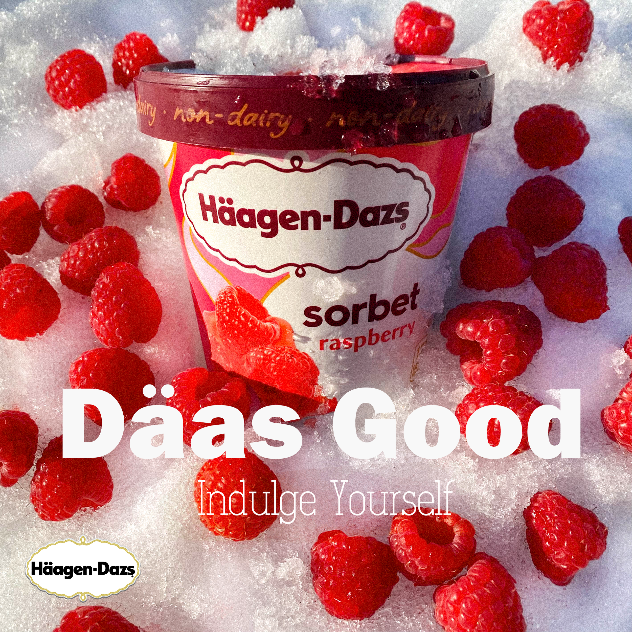
Häagen-Dazs: Indulge
This is a mock up of an ad for Häagen-Dazs. I went for a fruity, feminine appeal, as Häagen-Dazs’ target demographic is women between their 20’s and 30’s, so I lowered the contrast and used warmer tones. There is focus on “luxury” in the branding as well, which I tried to convey through the idea of “indulgence” and the grain filter that is put on faux-vintage advertising.
The font Salamandre (below) is directly from the Häagen-Dazs style guide, and the header is an approximation of their proprietary font, Humre Geometric Sans Bold One.
Editing and Photography: Peter Bayandin